Showing posts with label graphic communication. Show all posts

Saturday, 12 October 2013

Rights of access

A recent article in Wired on fonts for readers with dyslexia caught my eye. I'm not dyslexic so have no way of judging this objectively, but I find the text in Dyslexie easier to read than, for example, this open source alternative.  

Accessibility is something that, by law, any public sector organisation involved in publishing must take seriously: and the rest of you certainly should too. You won't always have the resources to get all of your documents translated or turned into Braille, for instance, but if you're publishing for the general public there are some basic things you can do to make your documents more accessible for readers with additional needs like dyslexia, or with levels of literacy that aren't as high as your own. For example:


  • For on-screen documents, if you're publishing PDFs, a clickable table of contents based on XML heading styles (easily created in Word) helps visually impaired users with screen readers to navigate your document. Make sure headings have meaningful titles and follow a logical sequence and hierarchy.
  • For websites, publish transcripts of any videos and podcasts, and include alt text for images. More information is available at W3C, but the best bit of advice I can give is to carry out extensive, iterative user testing before launching a site.


Just as many of the principles of good web writing also apply to good writing generally, so a lot of the advice for readers with dyslexia is helpful for those of us who don't have. For instance, this style guide from the British Dyslexia Association recommends large sans serif fonts with bold headings, no block caps, left alignment, bullet points, the active voice, and clear instructions given in short sentences without too many abbreviations or too much jargon. All of this stuff is good practice for effective written communication the rest of the time.

Tuesday, 13 August 2013

His master's tone of voice

This recent Marketing Week post on corporate tone of voice caught my eye. This figure is particularly striking — "brands [globally] spend $13bn (£8.7bn) a year on visual identity and just $2bn on verbal identity" — but it's encouraging to read of brands like O2 and Nationwide taking the war on jargon more seriously (especially as I'm a customer of both).

I wouldn't say O2's 'be more dog' billboards tell us anything useful about the clarity of the company's communications, though: the test is how easily customers can read small print and speak to call centres, not what they take from an abstract ad campaign. Attending to those small details might not win many headlines or awards, but it will help a brand quietly build a good reputation. Equally, we shouldn't assume that because a company's outlook is irreverent and unfussy it necessarily produces clear, consistent messages or makes the most effective use of communication channels. Corporate mission statements that read like Facebook status updates tend to grate.

A common complaint is that the language organisations use is often shaped by backroom technicians rather than frontline communicators, who end up having to work as translators so the public can understand what their colleagues are on about. If it's not possible to involve sales and marketing staff in the terminology process from the start of a project, it can at least help to have a comprehensive style guide that acts as a jargon-to-plain English dictionary.

This is all particularly true on social media. Corporate communicators are nowadays encouraged to speak to customers in their own language online; this is sensible, but it requires a solid grasp of who those customers are and what their language is like. As with every other aspect of the internet, risks and potential rewards are both magnified.

A final related point is that marketing folk tend to be more aware of the need to avoid jargon than senior management, who often need to be persuaded of the value of both plain English and social media. The best managers are instinctively open to such developments, won't treat them as tick-box exercises and will both invest and take part in relevant training: but this is more proof that good external communication depends on good internal communication.

Brands that aren't aware of these issues often end up annoying the public and losing customers. Now, why not have a look at a fellow comms guru's advice on a few things firms can do to avoid annoying journalists and losing press coverage?

Friday, 26 July 2013

The open society and its enemies

Thrill-a-minute hedonist that I am, I've spent the week reading Facts are Sacred, the Guardian's new book on data journalism, and The Signal and the Noise by clever clogs Nate Silver. The usual low standards of Guardian subbing are met, but ignoring that there's some interesting content. I note that the New Statesman, New Scientist and several marketing magazines have also devoted recent front covers to big data.

Nate Silver is impressive on the limitations of data; what he really advocates is an approach combining both quantitative and qualitative analysis, as well as a Bayesian method of improving one's probabilistic forecasts as the evidence changes. His advice — again, equally applicable to anyone in business, politics, communications or journalism — is to be consciously aware of your own biases if you want to overcome them and see the situation objectively. You hardly need me to add to the mountains of textbooks already written on how institutional groupthink and inertia have brought down many once-mighty companies. The challenge is to constantly apply this scepticism to your own positions.

At the risk of coming over all Blairite, there is also an open/closed distinction at work here, and the point applies as much to mindsets as datasets — and it cuts completely across traditional left/right or even liberal/conservative lines. As a recent Economist piece put it: "Our ideological sympathies are not good predictors at this point of how we feel about issues of digital privacy and electronic freedom. The fact that these issues don't have a clear ideological colouration yet is important because they are among the most crucial issues of the 21st century."

I would summarise this as the division between those whose instinct is to make information more widely available, and those whose instinct is that it should remain the preserve of responsible gatekeepers of knowledge — between:


We could list more examples, but the point is that this battle against banal illiberalism will define the era of big data and big brothers. Those of us working in communications are at the frontline, so we might as well get ourselves on the right side. If you're a journalist: understand how data can be used both to find and to illustrate stories, carefully craft and submit FOIs,1 resist the lure of churnalism; if you're in PR or marketing, convince your bosses to make openness and clarity an integral part of your brand, develop a responsive social media presence that makes this a reality, and never let the cover-up eclipse the crime.

As YouGov's Peter Kellner says: "knowledge is not only preferable to ignorance in principle; it also makes for a healthier society in practice". Encouragingly, one of the 10 design principles on the new gov.uk site is: "Make things open: it makes things better." What we really need is for this message to filter up to ministers and senior civil servants, and down to middle managers.

The point isn't that we need to be anti-capitalist or anti-government in principle; just that, to make both of these essential parts of our society work better, we need to keep a close eye on them from inside and out. As citizens we have to hold public bodies and global companies to account every bit as ruthlessly as we hold producers to account when we choose whether or not to buy their goods and services. As employees we need to fight institutional cultures that prioritise the organisation above the consumer or the public.

Erring on the side of this openness is good for society; whether it's good for individuals is an entirely different question.

1 I recently did this in my capacity as an elected member of Dowanhill, Hyndland and Kelvinside Community Council, and after waiting nearly a month was told by Glasgow City Council I'd need to pay a fee of £90 to get the answer I was looking for. But don't let that put you off. ;-)

Wednesday, 17 April 2013

The political scientist

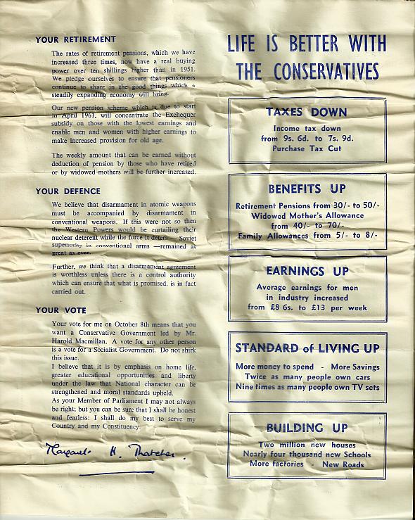
After Margaret Thatcher died, this leaflet from her third (but first successful) parliamentary campaign did the rounds on Twitter:

As an editor, I can't help noticing that there are four pages of the stuff, not to mention the usual assortment of random and pointless capitalisations (some things don't change).

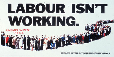
I doubt, by the end of her political career, she would have stood on a platform of 'BENEFITS UP' — but I think, policy aside, it tells us a lot about how political communication changed in the second half of the 20th century.  Fast forward to her leadership of the Conservative Party and her time as prime minister, and compare her first endearingly amateur leaflet with these very influential, clear and direct adverts.  First, the Saatchi campaign that got her elected:


Then the advert I most associate with her time in office, 'AIDS: Don't Die of Ignorance':


We don't tend to think of Thatcher as one of the great political communicators — admirers and detractors both point more to her unshakeable ideology and her force of personality as the secrets of her success — but we might remember how much of the professionalised media management Blair, Mandelson and Campbell perfected in the New Labour era began with her and her press secretary Bernard Ingham.  Perhaps, also, her dislike for nuance, subtlety and intellectual contortion allowed her to present simplified, easily understood messages in a way that has often eluded highbrow leftwing opponents.

The one epitaph being consistently applied by both friends and enemies is that 'you always knew what she stood for'.  In politics I'd prefer to live by Keynes' maxim, and my instincts would always favour consensus over a 51% strategy: but we can't deny the power that the Thatcher brand held for so many people for a remarkably long time.  The appeal of that uncomplicated approach, and the way her image personified her ideas, surely holds lessons for today's corporate and organisational communicators.  Like Supermac, and in a way her biggest rivals Tarzan and the Welsh Windbag never matched, the Iron Lady embraced an opponent's epithet and turned it greatly to her own advantage.

However, I think today marks the moment the brand overreached itself; achieved Thatcheration point.  A ceremonial funeral (a state funeral in all but name), complete with several hundred serving members of the armed forces, a cancellation of PMQs and a silencing of Big Ben, seems to me fitting only for a head of state, not a former head of government.  That conservatives fail to grasp the difference shows the hold she still has on their worldview.

I hope, then, I won't upset anyone by suggesting that now is the time to lay the brand to rest, not to immortalise it.

Monday, 28 January 2013

Save the data

This week we learned that Glasgow (my home town) has been volunteered to host a pilot project to collect and use urban data more efficiently. The idea is to link up real-time info about transport, traffic and energy to make delivery of related public services more responsive. Even in a medium-sized city like ours, the amount of relevant data my fellow citizens generate would seem to make this a huge job.

According to some data I just found on the internet, 90% of all the data that exists was created in the last two years. The challenge of sorting through all of this stuff, and condensing or consuming it for some useful purpose — for research, for commerce or just for fun — is becoming one of the great communications challenges of the age. Essentially, the job of any professional communicator has always been to sort through a lot of data and transform it into useful information: in journalism this means bringing out the salient facts of a story, in marketing the key selling points of a product or service, in PR a bit of both. But how do we go about sorting through the deluge of data that exists now?
  
JISC's rather good newsletter has some ideas about how we as individuals and institutions might go about this daunting task. I liked point 6, though it doesn't seem a particularly risky claim to suggest the visualisation of information will increase. The project to display interactive information about every bomb dropped on London in WWII, explored on the next page of the newsletter, is a fascinating example.

It's worth remembering that not all of this is new. This Economist article from 2007 on the history of graphic displays of information contains some examples that are just as impressive and eye-catching now as when they first appeared centuries ago. It's hard to think how today we could better illustrate the disaster that was Napoleon's campaign in Russia than by Minard's chart, while Playfair's beautiful depiction of wheat and labour prices seems to anticipate the Manhattan skyline. The dismal science can be fun too.

The JISC piece also leaves out the problem of institutional bottlenecks: right now I'm trying to explore visual.ly and easel.ly, but the browser on my work computer is obsolete and my attempts to get IT to upgrade it have so far proved futile. The potential for big data is exciting, but any big organisation generating the stuff is also liable to be sluggish in working out how to deal with it.  Big is not always beautiful, as this Guardian article explains. Mountains of data are of little use if your local council only consults 42 people about a major planning decision, then ignores them and does what it wants anyway.

One final point: as with all technology, the information revolution merely magnifies existing trends in society and human nature to produce new opportunities and new dangers. Might the disturbing extent to which American politics has become polarised be at least partly a feature of the ease with which readers, viewers and listeners can now avoid accessing opinions they find unfavourable?

Monday, 31 December 2012